Social:
Navigation:
Music:
On
On
MENU
CLOSE
Elie — G ✺
WORK
ABOUT
CONTACT
MENU
CLOSE
Elie — G ✺
WORK
ABOUT
CONTACT
Case N°
Case N°:
Case N°:
[002]
[002]
Visit
Sweden
Visit
Sweden
Reading Time:
Reading Time:
Around 5 mins
Around 5 mins
/About The Project
The project was about migrating Visit Sweden design from Sketch to Figma and create a new comprehensive design system that meets industry standards.
The project was about migrating Visit Sweden design from Sketch to Figma and create a new comprehensive design system that meets industry standards. The end results were a high-quality component library and a well-built local style that helped the design team increase consistency and efficiency in the design process.
/Problem Statement
Previously, the design for visitsweden.com existed in Sketch, but it lacked a comprehensive design system and style guide. This resulted in inconsistent design and a poor user experience. Additionally, the components used in the project did not meet current industry standards.
Previously, the design for Visit Sweden existed in Sketch, but it lacked a comprehensive design system and style guide. This resulted in inconsistent design and a poor user experience. Additionally, the components used in the project did not meet current industry standards.
/Goal
The goal was to migrate the existing design from Sketch to Figma and establish a comprehensive design system and style guide that adheres to modern design principles.
The goal was to migrate the existing design from Sketch to Figma and establish a comprehensive design system and style guide that adheres to modern design principles.
/Challenges
Ensuring consistency across all designs was challenging and required close attention to detail. Additionally, creating a design system that was both scalable and could accommodate future growth and development proved to be a complex undertaking.
Ensuring consistency across all designs was challenging and required close attention to detail. Additionally, creating a design system that was both scalable and could accommodate future growth and development proved to be a complex undertaking.
/Impact
The project resulted in enhanced design consistency and efficiency by creating a high-quality component library and a well-structured local style guide. This initiative empowered design teams to collaborate more effectively and ensured seamless alignment with Visit Sweden’s design standards.
The project resulted in enhanced design consistency and efficiency by creating a high-quality component library and a well-structured local style guide. This initiative empowered design teams to collaborate more effectively and ensured seamless alignment with Visit Sweden’s design standards.
/Project Info
Client
Client
Visit Sweden
Visit Sweden
Role
Role
UX Designer intern at Fröjd Digital Agency.
UX Designer intern at Fröjd Digital Agency.
Year
Year
2023
2023
Contribution
Contribution
Design System, UI Design
Design System, UI Design

Photo credit: Roger Borgelid / Westsweden.com
Photo credit: Roger Borgelid / Westsweden.com
Defining
Defining
Building
Building
Design Audit
Design Audit
/The Process
A non-linear design process consisting of design audit, defining, and building was employed to establish an efficient and sustainable design system.
The project was about migrating Visit Sweden design from Sketch to Figma and create a new comprehensive design system that meets industry standards. The end results were a high-quality component library and a well-built local style that helped the design team increase consistency and efficiency in the design process.
/Defining
In the definition phase, I collaborated closely with the project manager, art director and developers to identify their needs and goals. By involving the target group early in the process, I could adapt the design system to the needs of the customer and Fröjd employees. I also established effective communication structures to ensure smooth collaboration and handle any challenges quickly and efficiently.
Key Insights
Visual Consistency
Visual Consistency
The art director emphasized the importance of maintaining visual consistency.
The art director emphasized the importance of maintaining visual consistency.
Efficient development
Efficient Development
The developer expressed the need for well-documented design components.
The developer expressed the need for well-documented design components.
Storybook
Storybook
The design system In Storybook is not updated and is 8 years old.
The design system In Storybook is not updated and is 8 years old.
Old Sketch design file
Old Sketch Design File
Style guide and components were in Sketch and not updated at all and lacked documentation.
Style guide and components were in Sketch and not updated at all and lacked documentation.
Scalability
Scalability
The team expressed the need for a design system that can be adapted and scaled.
The team expressed the need for a design system that can be adapted and scaled.
Future development
Future Development
The project manager highlighted the need for a design system that meets the specific requirements for future project development.
The project manager highlighted the need for a design system that meets the specific requirements for future project development.
/Three Different Hats
Developing a design system with a focus on user experience presented unique challenges, especially given the limited resources and tight time frame. This project required a varied approach and I wore three different hats:
The project was about migrating Visit Sweden design from Sketch to Figma and create a new comprehensive design system that meets industry standards. The end results were a high-quality component library and a well-built local style that helped the design team increase consistency and efficiency in the design process.
[H 001]
UX Designer hat to ensure a user-centered design that is based on the target group's needs and challenges.
[H 002]
UI Designer hat to create visually appealing and consistent elements.
[H 003]
The developer hat to create a design system that can be transferred to Storybook for an easy test, debug and collaboration.
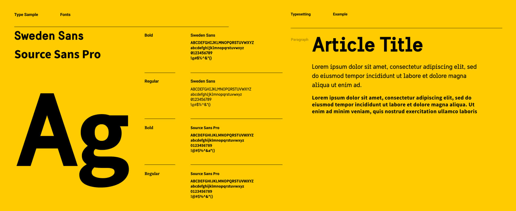
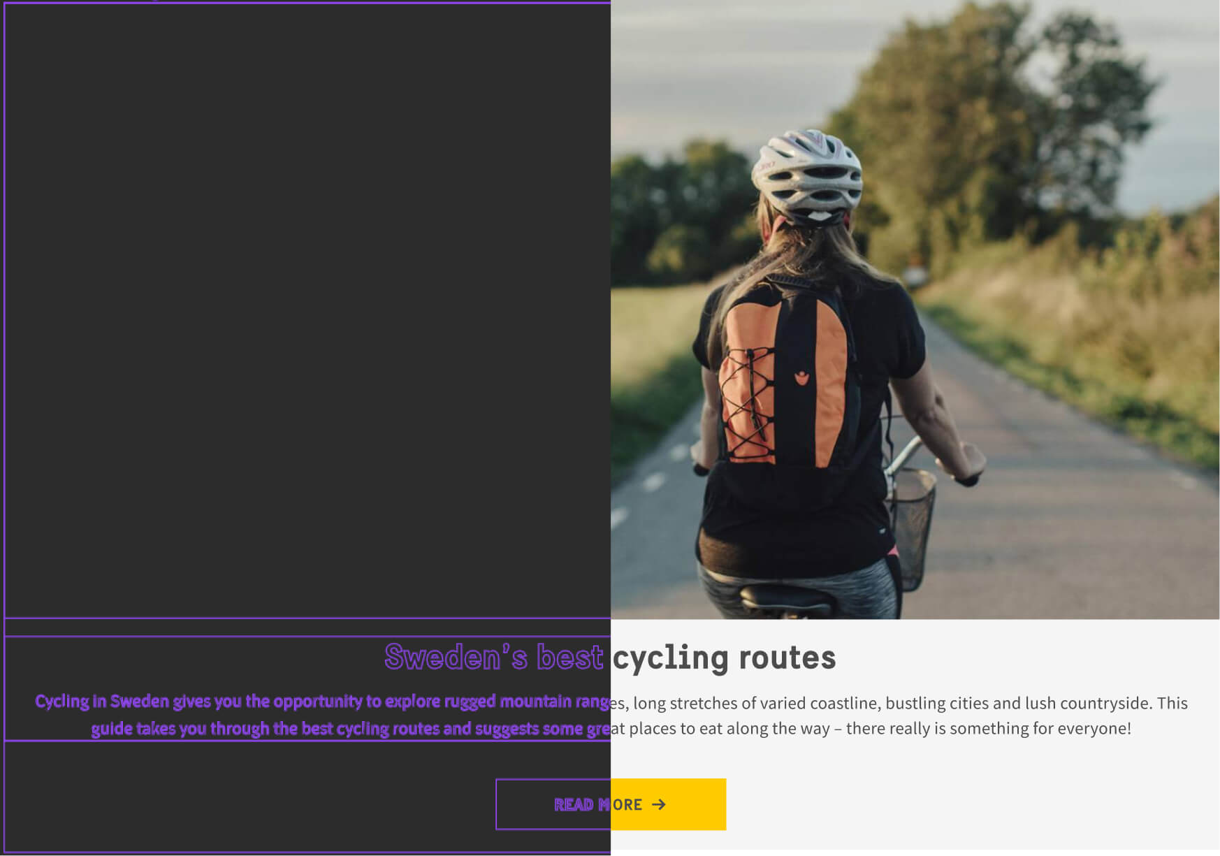
/Design Audit
Step [001]
I Started the migration of the design from Sketch to Figma, which was facilitated by the import functionality in Figma. Upon importing the design into Figma, I noticed the absence of design documentation or style guide, necessitating a visual design assessment. This assessment involved evaluating and determining the current state of the design in Figma and identifying what needed to be created. It was also crucial to assess if the component sizes, colors, and text styles aligned with the existing website.
Step [002]
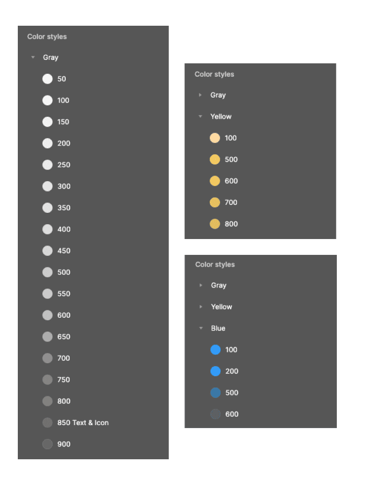
The second step involved gathering assets and reviewing the details of each component at various breakpoints. I examined design assets such as colors, text styles, sizes, and spacing. This provided me with an overview of each component on the website. Collecting all the materials was challenging and time-consuming, but with the aid of appropriate Figma plugins, Chrome extensions, and other HTML/CSS tools, the task became more manageable.
Step [002]
The second step involved gathering assets and reviewing the details of each component at various breakpoints. I examined design assets such as colors, text styles, sizes, and spacing. This provided me with an overview of each component on the website. Collecting all the materials was challenging and time-consuming, but with the aid of appropriate Figma plugins, Chrome extensions, and other HTML/CSS tools, the task became more manageable.
Step [003]
After the design audit, I got a detailed overview of each component style and there were no major differences between the migrated design and the current website. With the design audit results and the needs of the target audience in mind, it was time to move on to the next step, which meant building basically everything 😄.
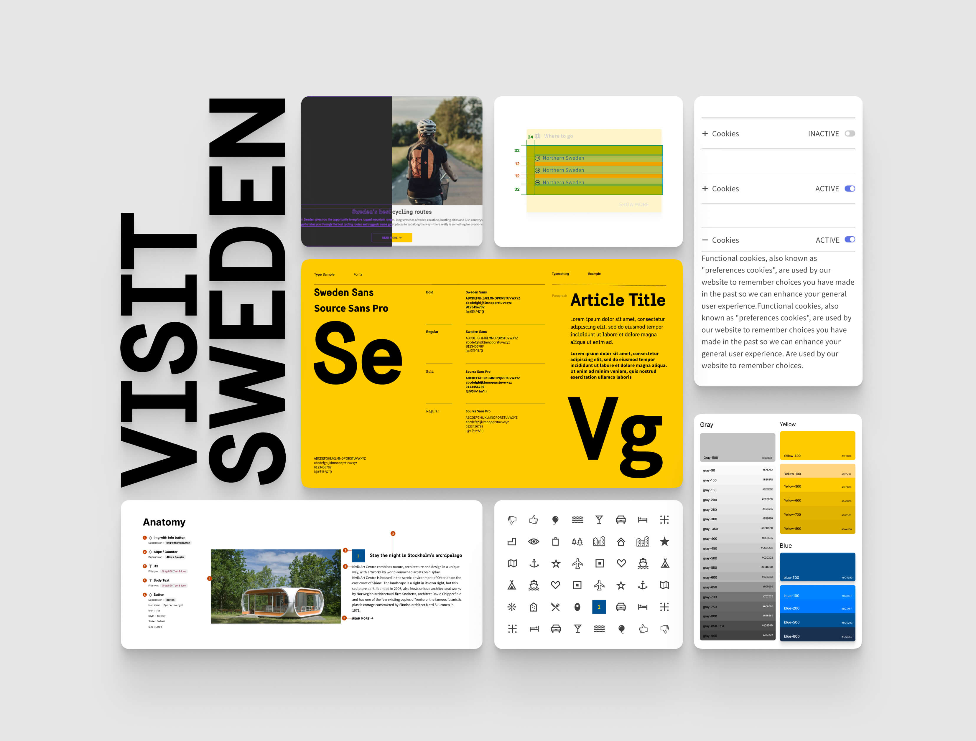
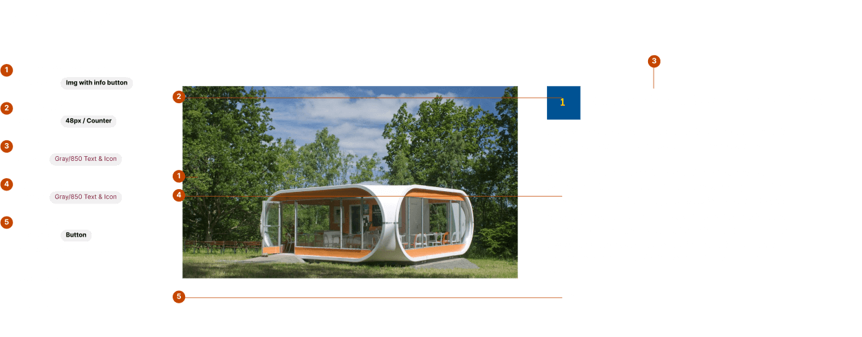
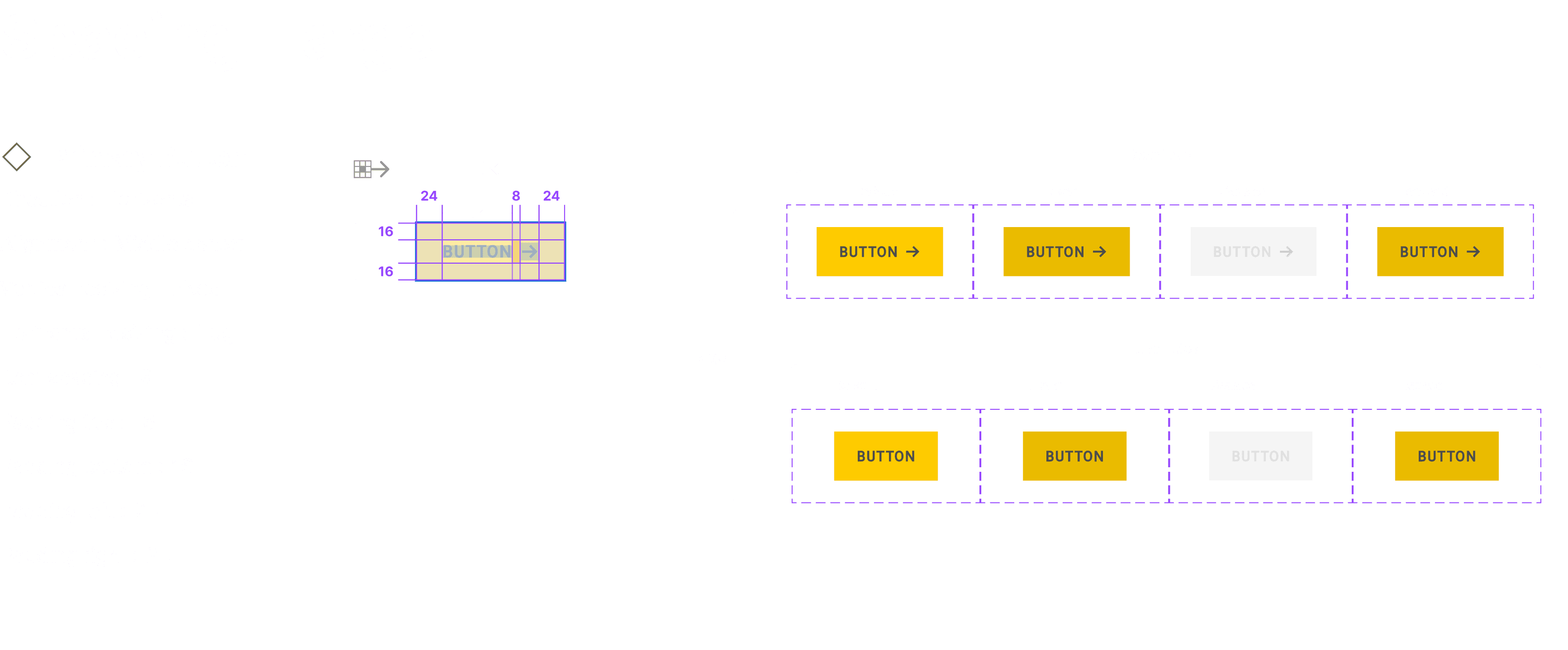
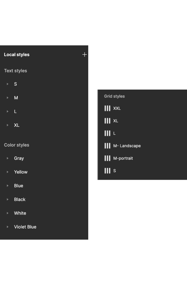
/Design
The process began with prioritizing the foundational elements of the design system, including an accessible color palette, typography, grid, spacing, buttons, etc. Next, I focused on developing more complex components such as molecules, organisms, templates, and pages. This was done to create a comprehensive and cohesive design system.
The project was about migrating Visit Sweden design from Sketch to Figma and create a new comprehensive design system that meets industry standards. The end results were a high-quality component library and a well-built local style that helped the design team increase consistency and efficiency in the design process.
Atoms
Atoms
Molecules
Organisms
Organisms
Templates
Templates
Pages
Pages
/Principles I Followed
[001]
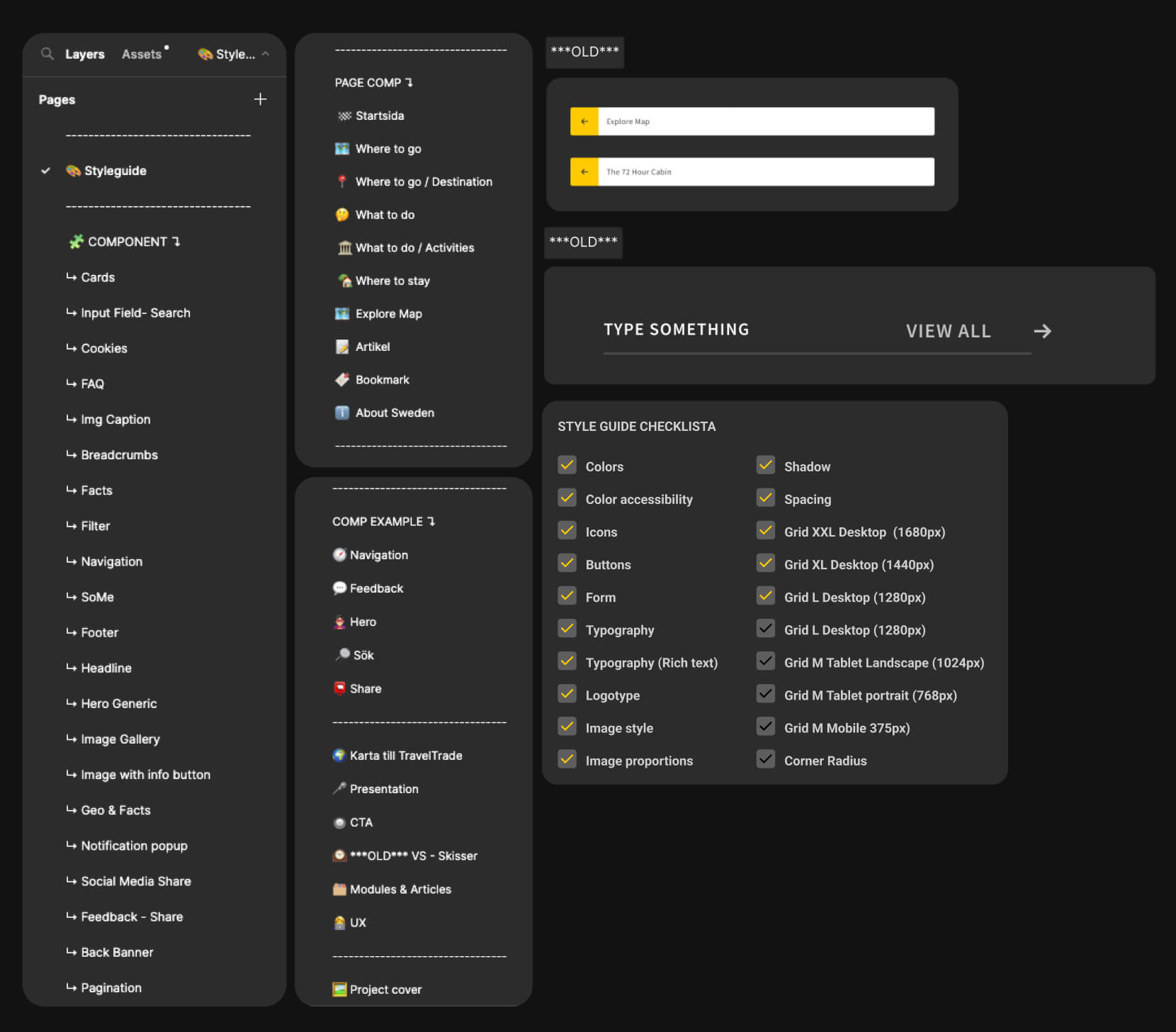
Nested components" are used to reduce the number of components in the project.
[001]
Nested components" are used to reduce the number of components in the project.
[002]
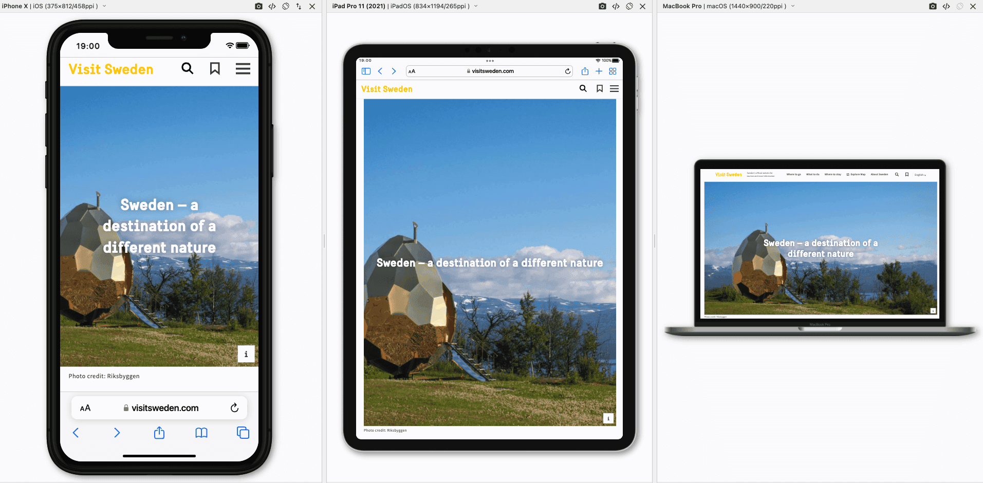
I utilized Auto Layout in Figma to build all components, enabling me to reuse them across different devices or layouts.
[002]
I utilized Auto Layout in Figma to build all components, enabling me to reuse them across different devices or layouts.
[003]
States for components such as hover, focus, error, and disabled state.
[003]
States for components such as hover, focus, error, and disabled state.
[004]
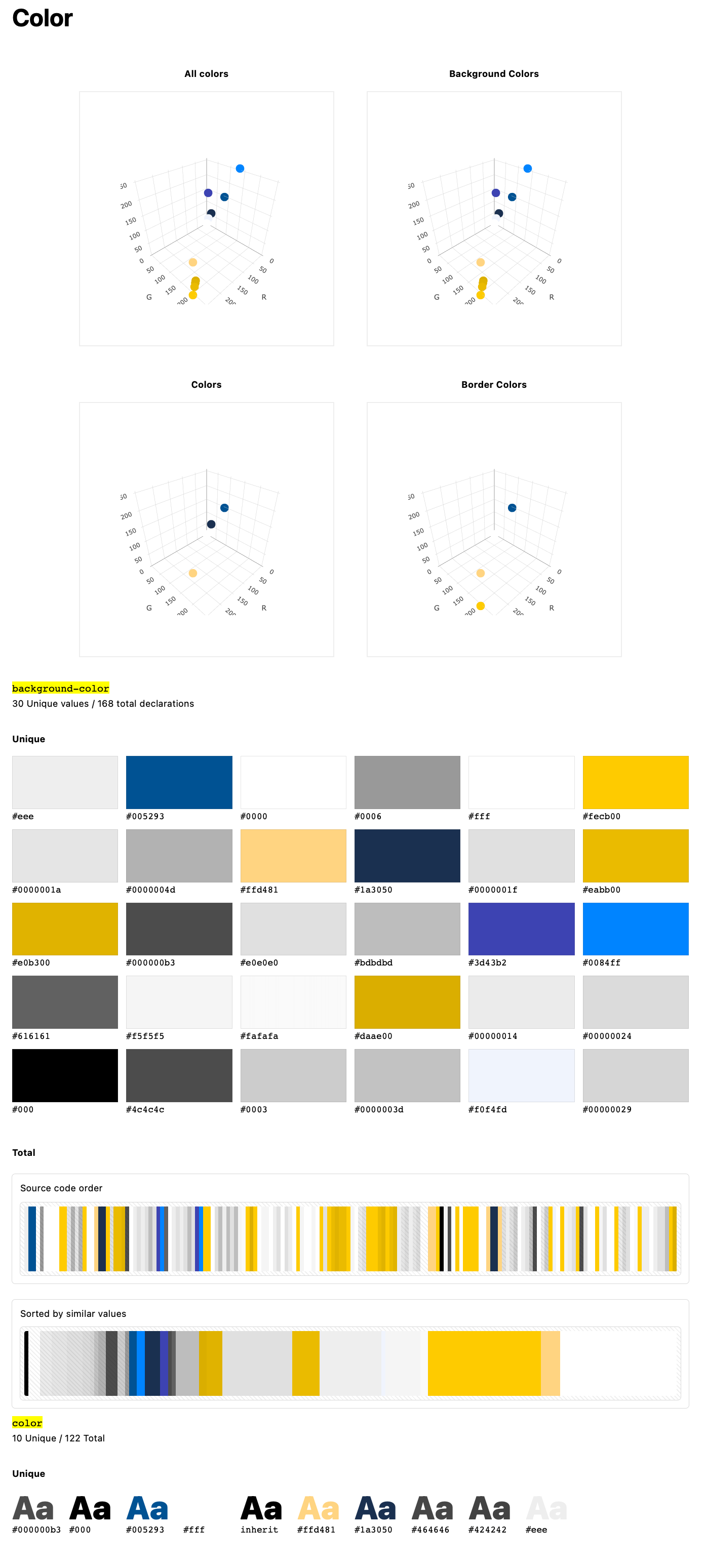
Color accessibility is checked during the creation of the color style and for each component.
[004]
Color accessibility is checked during the creation of the color style and for each component.
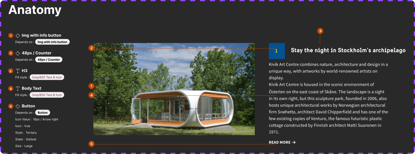
[005]
The initial step in component documentation includes variants, anatomy, layout, and spacing.
[005]
The initial step in component documentation includes variants, anatomy, layout, and spacing.
[005]
The initial step in component documentation includes variants, anatomy, layout, and spacing.
/A System Within A System
The creation of a style guide facilitated a streamlined approach to building new components and further developing templates and pages.
The creation of a style guide facilitated a streamlined approach to building new components and further developing templates and pages.
/Next Step
The design system is an ongoing project, and so far, we have a set of components ready, which can be crucial in terms of efficiency, consistency, and future development. The next steps could be as follows:
Design tokens.
Completing the documentation of components.
Continuous updates of the design system.
/Summary
During my internship as a UX/UI Designer at Fröjd digital agency, I was responsible for migrating the design for visitsweden.com from Sketch to Figma and creating a comprehensive design system and style guide. Challenges included ensuring consistent design elements and creating a scalable design system for future growth. I conducted a design audit to evaluate and establish existing design elements and created a detailed list of what needed to be built. By utilizing Custom properties, Nested components, and Auto Layout in Figma, I created a cohesive design system with various components and variants.
During my internship as a UX/UI Designer at Fröjd digital agency, I was responsible for migrating the design for visitsweden.com from Sketch to Figma and creating a comprehensive design system and style guide. Challenges included ensuring consistent design elements and creating a scalable design system for future growth. I conducted a design audit to evaluate and establish existing design elements and created a detailed list of what needed to be built. By utilizing Custom properties, Nested components, and Auto Layout in Figma, I created a cohesive design system with various components and variants.
LET’S
LET’S
TALK
TALK
Made with a lot of 🖤 And ☕️
©2024
MENU
CLOSE
Elie — G ✺
WORK
ABOUT
CONTACT
MENU
CLOSE
Elie — G ✺
WORK
ABOUT
CONTACT
Music:
On
On
On
On